|
| Superman 252 |

|
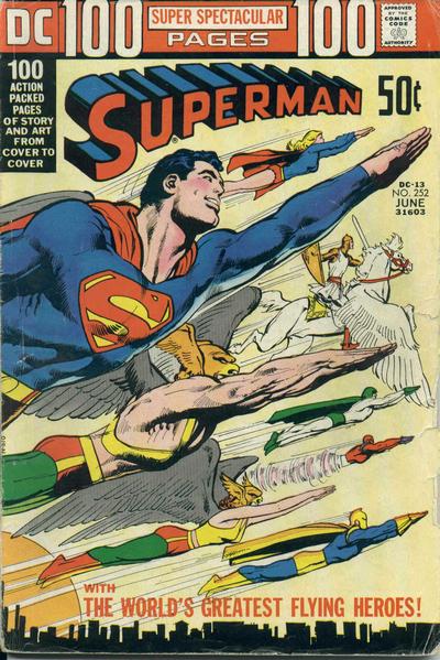
| Martin wishes he was a flying hero... |
Martin Gray

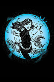
DC Special: The Return of Donna Troy
I could have lived without ever again seeing the
Titans of Myth (why would
anyone refer to themselves as
mythical?). Posturing loons wittering away about how they're all THAT, sister-brother. And
the incest angle, I know it's a trad classical god thing, but can we ignore it please? The Titans of Ick is what this bunch
are.
Is this the first appearance by the ToM since Zero Hour? I'm getting the impression that the Lilith link (wasn't
she the adopted daughter of Thia or somesuch?) is gone/will be ignored. That girl gets NO respect. Surely a story as wordy
and complicated as this might as well have been a toofer, giving us Lilith back at the same time as Donna.
I do appreciate
that Phil and co (loved the art) were trying to give us a good story - I'm just disappointed to see a layer of complication
I'd thought gone from Donna's past re-attached to the character.
And `flashing thunder'? Isn't that `bullets and bracelets'?

Manhunter 8 - 'Smarmy bitch'
This is probably my favourite new DC title since Chase - the tough gal feel is similar - and it continues to rocket along,
using the wide canvas of the DCU as its playground. Our anti-heroine Kate is still trying criminals in court by day while
hunting them at night, and she's got the attention of some rather intriguing villains this issue (the last page reveal is
great). Shadow Thief is on trial for the (apparent) killing of Firestorm and his dad and stepmom (the superbly named Felicity
Smoak Raymond) appear on panel for the first time in years in a touching couple of scenes - and how refreshing to see someone
age in comics (this issue seems to occur at the same time as the last Firestorm, when Jason/Ronnie arrive at Ronnie's dad's
home and find it empty).
The only bum note for me is the chilling scene furthering the Manhunter Stalker B-plot. Given how different the DC Manhunters
not from Mars have been, I can't see who would hate the lot of them.
Still, it's intriguing stuff.
Oh, and the SB in question in Cheshire, in a rather neat fight scene.
All this and a sidekick in his undercrackers.
I missed regular artist Jesus Saiz (and Moses invests?) this time, but the fill-in penciller - sorry dear reader, I've
not got the comic to hand and the DC net publicity still thinks Jesus Saiz pencilled for inker Jimy Palmiotti - did a decent
job. Try this book now, don't wait for a trade paperback . . . cos if it doesn't get the sales quick, it'll be gone and you'll
have missed something mighty fine.
The Avengers (Dissed) 502
Ye Gods, can Brian Michael Bendis think of nothing climactic for the Avengers bar explosions? How many so far this
storyline? And all in two-page spreads.
The level of craftsmanship here just doesn't cut it. The dialogue is rubbish
with the Avengers coming across as rank amateurs, standing around waiting to be killed, moving only when Cap gives an order.
Excuse me, this is a team with loads of leader figures - T'challa, Carol, Thor (was he there, who could tell?), Reed, Namor,
Clint . . . even Quicksilver has led a group. Why are they not breaking down into squads and sorting stuff out?
A
mystery assailant is bombing Avengers Mansion, so everyone gathers on the steps of said mansion? Idiots. And again with the
'oh why are our ENEMIES attacking us?' The clue is in the question, kiddies. Is the idea to make the New Avengers look good
by comparison, so they can be merely competent?
The (pardon me, but it IS a Marvel comic) much-vaunted David Finch/Danny
Miki art is terribly shoddy in terms of storytelling - this story really needs George Perez or someone who similarly relishes
the challenge of giving us heroes by the dozen who are individuals, not hurriedly dashed figures. Does everyone HAVE to look
alternatively whiny and sneery?
But the person who perhaps should really be hanging his head in shame is so-called
colourist Frank D'Armata. Bendis was quoted as follows in a recent Silver Bullet Comics: 'Joining us on Avengers is colorist
Frank D'Armata, who is the colorist on UlXM now. I think he's amazing. I hand picked him for this assignment and he's a big
part of the storytelling.'
Well colour me under whelmed. What's the point of David Finch at least trying to draw every
Avenger ever if Frank D'Armata is just going to smear everyone with red washes. OK, if this was motivated by the script -
return of the Red Dust, Wanda Gets Her Washday Wrong . . . whatever - I could buy it, but there was no excuse. Surely good
colouring should help he storytelling, highlight stuff that needs to be noticed by us, direct our eyes to the action, add
mood, underline things. The usual stuff. Instead, things are obscured throughout, with only a couple of decent panels of attacking
Kree giving light relief. If Mr D'A doesn't want to do a team book, fine, other people would step up to the plate. And if
he was told to take this approach, my apologies - but why? There are ways of adding intensity with colour other than passionate
reds.
I salute letterer Albert Descehsne and his computer programme for being the only obvious professional on the
book - shame he had to letter all those $%%#@!*s - dearie lord Mr Bendis, this is a lousy writing trick best saved for the
Ultimate books.
I wasn't keen on this issue.
Superman/Batman 7
At least that's what it says inside the book - the cover still 'boasts' one of the ugliest logos ever seen
on a comic - someone obviously thought it was a 'kewl' idea to combine the Superman shield with the Bat emblem. Of course,
the shapes don't easily sit inside each other, and the result is Very Ugly Indeed.
Mind, that matches the art this issue. God knows I'm no fan of regular penciller Ed McGuinness, but while exagerrated,
at least his Superman and Batman are instantly recognisable. Guest Pat Lee - A Wizard favourite, which is synonymous with
the phrase 'be afraid' - produces the ugliest art I've seen on a comic book since Carlos Meglia filled in on Superman a couple
of years back. And at least that fella's artwork, while hugely unsuited to Superman, has a weirdo charm. Pat Lee's seems to
be going for a Manga look and either he hasn't the skill to pull it off, or he's absolutely tip-top at homaging some very
ugly Manga. The characters (as well as Superman and Batman we have their junior versions, Superboy and Robin) spend the issue
staring down their noses and scowling. The facial work is horrendous - I'd never know this was supposed to be Superman and
Boy without their costumes. And while there's the odd halfway decent figure, most of the pages are hideous to l! ook at and
difficult to follow - Lee seems to have no facility for layout. Take page six, for example (which Terence may helpfully extract),
which features pointy figures looking very determined but mainly aimless.
Lee seems much happier drawing giant robots and robot suits - presumably this is why writer Jeph Loeb has the
teens spend several pages in metal jackets which have been modified so that they 'best utilise our powers'. Robin
has powers? I'd have preferred Robin and Superboy to don metal suits cos Enemy of the Month Metallo is leaking nasty radiation;
because Robin needs a suit to battle big robots things and Superboy didn't want to feel left out; or 'we fancied wearing these
neato suits the 13-year-old Japanese Toyman has lying around with our emblems on'. Yup, the other character this issue is
the ludicrous laddie who should rightly be called Toyboy - Batman and Superman ask their proteges to go ask him to join their
gang, replacing Harold the hunchback as inventor of Bat-gear.
Yes, someone who's been bad in his only appearance before this series (he built a handy rocket last issue when
the world's safety was at stake) is now prime fodder for Bat-recruitment. Supposedly he's at a crossroads in his life
and could become a goodie OR a baddie, so the teen heroes have to persuade him it's fun to play on the side of the angels.
Jason Todd might disagree.
I must single out the colouring by Dreamwave, whatever that is - presumably a computer programme which barely
recognises primary colours. It would be nice if the mood of a super-robot battle in Tokyo was something other than grey, but
there you go - hurrah for an equal ops issue . . . it can be appreciated by the sighted and the blind alike.
This comic is predictable nonsense, big and dumb and likely to please readers who have the Wizard sensibility
that anything vaguely Transformer-like is marvellous, but as a bridge between the very silly Lex Luthor storyline which filled
the previous six issues, and the likely-to-be-crap but must-read new Supergirl storyline to come, it's eminently missable.
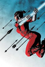
She-Hulk 1/Iron Fist 1
Well, two new number ones from Tom Brevoort's editorial stable, both
starring green heroes. Nice to see they share the same '1st issue'
blurb, one green and yellow, the other yellow and green, but then,
I'm sad. Not keen on the new logos for either, though - She-Hulk's is
too neat, Iron Fist's too plain.
Oh well, to the contents. I wasn't expecting much from the announced
She Hulk goes LA Law set-up, but it's a really nice read. We see Jen
lawyering, partying, Avenging, shagging and a flashback shows why she
might be the party girl she is today. Plus, it has a great
title, 'The Girl From Gamma Gamma Gamma' and Jen shows a liking for a
great British pop song (which I won't give away). The dialogue is
first-rate without being Bendis-ummm-fuck-'realistic' and the art is
great fun - my only quibble being that at times Jen looks too
muscular and occasionally chubby of face. Best of all is the villain
the Avengers face, an old favourite of mine. I've not seen any
previous work by the writer and artist - and hence can't recall their
names - but I now have high hopes for this.
Iron Fist was less great but I'll give it a few issues. It's a pretty
straightforward 'hero loses purpose' set up, which doesn't bode well
for surprises as we know where the story will end up - I'm not one
for just enjoying the journey, I like a surprise close, too. I recall
the pencils as being by one Kevin Lau and they're typical Marvel-
Manga cack - big eyes, huge eyebrows, clumsy movement . . . and poor
old Misty Night looks a right freak. The best scene was the opening,
with an ordinary fella in trouble - he gets far better
characterisation than Danny Rand, and Lau's art is much nicer, as if
he's not yet gotten around to aping Evil Manga. The cover's nice,
but iron Fist has a nasty clunky belt I take it he'll adopt by the
end of the arc or, as I like to call 'em - clever this - 'story'.
I'll give this a few issues on the basis of fond memories of Power
Man/iron Fist and his sexy costume.
I said I was sad.
|


